Research Task: The Language of Logos
- Abbie Vidler

- May 1, 2024
- 6 min read
For this research task, I have to explore examples of logos of businesses whether recently established or old, from there I have to examine the history of those logos (and show findings of new ones).
I must document my examples and reflect on my findings...
Barbie
A company that has been around since 1959, starting with simple cursive and keeping it cute and girly. In 1975, they trialed a flat 3D effect with thicker font; this is seen in the recent Barbie Movie Title. From there the thick font went a little thinner and slowly reverted back into the original logo design from 2009 to now (2024). They added a flower for the 'i' for one year, but went back to the dotted eye. The colour shade has deviated from a range of pinks, however now they have trademarked their colour to Barbie Pink.
This design is classic and simple, keeping to the girly style that has continued to stay recognizable to this day.

Logitech
A tech company that was established 1981 with a simple think font and a geometric logo, changing to stretched font with a flat drawing from 1988 to 1996. The logo was used throughout the years, changing from flat to 3D and with my vibrant colour until 2012 where it turned all black with simple tight font. It wasn't till 2015 it's logo become more tech-like and customer friendly, using the 'o' and 'g' (in Logitech) to create a smiling face. The font is thicker, futuristic and relates better to it's products, using the iconic 'G' for branding on products.
The logo is futuristic, it's also charming with the smiling face and it really captures what they sell.

Stella Artois
This company have been brewing beer since 1366 in Belgium, a very long time but only having changed their logo 10 times in those years; with it's long rich history the changes have been a bit more dramatic than Logitech or Barbie, originally starting out as just a horn and before developing the name in 1926-1962 into a stylised posh font before reverting to bold simple font in 1962-1973. 1973-1975 they create a logo with two red stripes and a star as an identifier, which was incorporated into later design.
In new designs, the original horn is used with a bold, thick font that somewhat resembles the original font from 1926. The design remains that iconic red and gold that has cemented itself into the design we see today; when I look at a company with this much heritage, I can't imagine them changing the design too drastically because it's very rememberable and almost everyone knows it.

YouTube
Newer than most than previously said, YouTube has maintained their design throughout the few years that they have been running; starting out with a simple bold text of YouTube, the 'Tube' being in a red box, and slightly being tweaked in 2011 to have a 3D look-- though it was dropped quickly in 2013 to avoid the shadow-- then changing the red in 2015. Until 2017 (to today), where YouTube stands alone and bold with a red play button on the side of it.
Maintaining the similar design has benefited them greatly, it's simple and identifiable; more importantly I feel like it's timeless, years from now (if it's still running by then), this logo with go with the times. 4

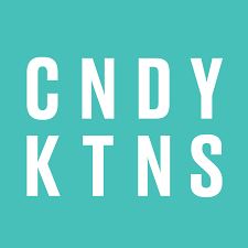
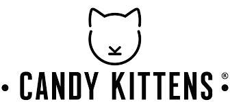
Candy Kittens
A new company established in 2012, it's iconic name is reflected in their product. Relatively new on the market compared previous ones, Candy Kittens has a simplistic bold font. It does have a little cat mascot that it their key identifier, a simplistic cat created with a few lines; this says that it's modern and simple. 6
Personally, I wouldn't say it's got a lot of charm like Logitech, but it is timeless with it's simple font. I could however see it as a little boring, maybe incorporating the cat into the text can make it more rememberable.
Walt Disney
An iconic name with a unique approach to logos, it originally started out as 'Walt Disney Productions' with the iconic Mickey Mouse at the forefront,; until 1937 were the name Walt Disney in handwriting would become the new logo, different variations of cursive font would go along the years (and changing from production to pictures in 1982. It wasn't until we saw the rememberable castle in 1985, moving to a more detailed one in 2006 and changing to just 'Disney' in 2011.
The castle isn't always integrated into products,mainly the lettering which in itself is very memorable with the cursive and fun font. The fun and distinctive font is classic as it shows from 1972 till now, the child-like font holds the ideals of the company- sparking creativity and happiness.

Wild
This company is newly established in 2019 (well, six years), and has given itself a great reputation for their products and that reflects in the logo as well. Their design is simple but dynamic, with the posh font and a touch of naturalistic feel; the font fits perfectly with the name and their aim. The colour of the font changes depending on the setting and ranges from white to green to pink (mainly depending on what the different flavored smell is.
Compared to the older companies on this list, Wild have kept modern but stylistic; their logo is really recognizable and iconic.

Refection on findings
As I explored logos, one thing really stood out to me, those companies with the most heritage had a lot more 'regal' elements-- except Barbie, that felt ahead of it's time. They try to include older design elements into newer designs to make it more memorable.
With newer companies, more so Candy Kittens, the logo is bland and basic, it doesn't have the charm that Logitech has or anything new like Wild; it's so modern that it's uninteresting.
Depending on personal preference of a logo design, it's best to keep it simple, memorable and keep the tone of the logo throughout the years.
As a bias, Barbie has the best logo, it's changed enough to explore what could be a good logo, but stuck with the original because it was already so characterful and interesting with the iconic pink and cursive font.
YouTube's logo is great for memorability, since it really hasn't changed at all.
A newer company like Wild has an interesting and pleasing logo that really suits their company's products and ideals.
As I explore different marketing designs and the trends, it's given me a good idea of what products/company aesthetics suit their branding, Logitech's logo really suits their business and doesn't really care for "trendy" graphic styles. The new look was beneficial to the company and created a new, fresh look; unlike another company, Pepsi.
They recently changed their branding/logo design, Pepsi has explored a variety of different designs, but always sticking with the iconic red, white and blue. They started with that colour scheme in 1951, then changing the font several times and in different shades-- changing their branding very regularly.
Their new look, is bad. The colours are extremely saturated and the font is very chunky in comparison to the thin outline around the logo. Looking at all the logos, they're forgettable. Sticking with the trends of cursive, then simplistic and bold, then flat then 3D -- until now with flat, saturated and boring logo.

Reworking the Pepsi logo
I wanted to try and rework the Pepsi logo because I feel like it could be so much better than what it is now, looking at them they're probably not even better, but it was fun to try and rework their branding.


1 A Jackson, design hill 'The Barbie Logo Unveiling Its Meaning, History, and Evolution', Jul 13, 2023. https://www.designhill.com/design-blog/the-barbie-logo-unveiling-its-meaning-history-and-evolution/ Accessed May 1st, 2024.
2 A Butler, DesignBoom 'new logitech logo by designstudio', Jul 8th, 2015. https://www.designboom.com/design/new-logitech-logo-by-designstudio-08-07-2015/ Accessed May 1st, 2024.
3 U/A, 1000 Logos 'STELLA ARTOIS LOGO', updated: Mar 22, 2024, https://www.designboom.com/design/new-logitech-logo-by-designstudio-08-07-2015/ Accessed May 1st 2024.
4 J Foley, CreativeBloq ' The YouTube logo: a history', Sept 27, 2023. https://www.creativebloq.com/news/youtube-logo-history Accessed May 1, 2024.
5 U/A, 1000 logos 'YOUTUBE LOGO', updated Mar 18, 2024. https://www.creativebloq.com/news/youtube-logo-history Accessed May 1, 2024.
6 U/A, Candy Kittens 'About Us', U/A. https://candykittens.co.uk/pages/about-us Accessed May 1, 2024.
7 Candy Kittens, Facebook 'Candy Kittens', U/A. https://www.facebook.com/CandyKittensUK/ Accessed May 1, 2024.
8 Belgium's Chocolate Source, Belgium's Chocolate Source 'Candy Kittens', U/A. https://belgiumschocolatesource.com/brands/candy-kittens/ Accessed May 1, 2024.
9 U/A, 1000 Logos 'WALT DISNEY LOGO', updated Apr 8, 2024. https://1000logos.net/walt-disney-logo/ Accessed May 1, 2024.
10 Valley Mist, Valley Mist 'Wild Natural Deodorant', U/A. https://valleymist.co.uk/brand/wild-natural-deodorant/ Accessed May 1, 2024.
Comments