Research Task: The Metamorphosis
- Abbie Vidler

- Jan 24
- 4 min read
For this research task, I had to take a look at the different ways that different artists approach the story of Metamorphosis by Franz Kafka.

Robert Andrew Parker's adaptation, 1994, etching and aquatint.
The illustration presents itself after the transformation and styled in a way that creates really interesting shadows with very minimal amount of line-making; only a focus on shape language, exploring dark shadows then following up to the beetle. Overall, this illustration has drama, but does seem rather light in tones to be very dramatic. My understanding through this illustration is that the man turned beetle is held up in his room, drained of all colours and almost like a jail; the transformation of the insect is the least uniformed thing in the illustration so we feel unsettled by it.

Peter Kuper, The Metamorphosis graphic novel, 2004.
Kuper's front cover of his adaptation, focuses on the character after transformation and creates a suspenseful image with lack of colour and dramatic use of shadows. The line-making stands out against the light that's pouring in and helps lead our eyes towards the figure standing in the light; this can either be someone else or figuratively being his own self; the tense illustration is elevated by the use of bold text and the bold red title. We get the feeling that the transformed man is scared by whoever is standing in the doorway, whether its because he's scared of anyone seeing him or scared of them.

Mario Jodra, 2016.
The next artist I came across and I was really intrigued with the style of this illustration, it looks like an etching with washes of colour over the top-- seeing how some lines go over other elements, though I could be wrong. Mario introduces more story elements, it's presented after the transformation and shows the beetle speared through, and an person watching on. There's warmth to this illustration because of the washes of colour and the light pouring in, so it could show content as well as a sadness with the use of textures coming through with that colour. The sadness shows through the person watching on, they're standing solemnly and are drain of vibrant colours, only dull.

Grace Aldrich, U/A.
Stumbling across this illustration, you can sense the disgust, fear and sadness. The use of colours, the greens and browns capture the overall feel particularly with the drapery around the beetle. It's also the way the beetle is posed, staring at it's spindly arms, seeing how what he's turned into. I also liked the silhouette of the man's face on the beetle, rather than the beetle itself being disgusted you get the sense that there is a man underneath without saying so. The light pouring from behind leads us from the drapery to the head and to the arms, it's a great sense of composition.
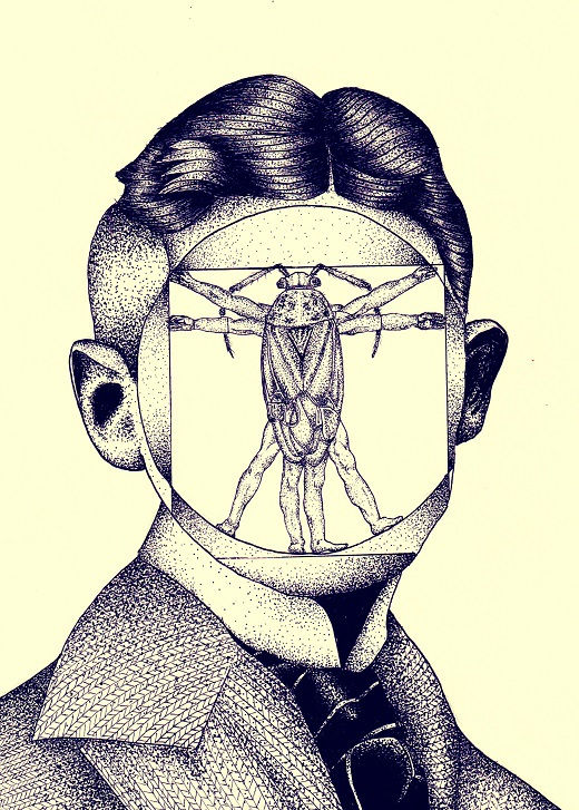
Vedran Stimac; 2016.
The next adaptation I looked into was Stimac's; instantly I caught the inspiration of Leonardo Da Vinci's 'Vitruvian Man', the beetle displayed the same way as Da Vinci's only inside a man's face. With the stippling style creating shadows and textures of the man it leads our eyes to the middle where the negative space of the beetle stands. The illustration feels less dramatic that previous artists that I looked at but it is unsettling, and also feels a little academic because of the inspiration.
Caroline Leaf, 1977
This animation adaptation is created using sand, glass and light; by adding lots of sand you block out the light and create shape; this unique technique conveys the story with no colour, and the result conveys the story with sorrow and tension, the movement is quick when it needs to be and is slow when we need to feel sadness. The level of detail that is worked around the sad to create different elements stand out more because of the light and the sand, it feels soft at times too, but sharp at elements that need to be standing out (such as the beetle).
Thoughts
My thoughts about these takes on 'The Metamorphosis' by Franz Kafka is that they all say something different in their own different way, but my favourite take has to be Grace Aldrich's.
The colours, the pose and the lighting each contribute to what we need to be feeling and the story we will be seeing; I love the way it's painted and how the lighting its painted on the drapery and on the beetle's skin. The mood that I get from the illustration tells me I need to feel sad with the browns and washout blues and slightly disgusted with the greens used.
1 Art Institute Chicago, U/A. https://www.artic.edu/artworks/227089/the-metamorphosis-1915-from-franz-kafka-dreams-diaries-and-fragments Accessed January 24, 2026.
2 Crown Publication, Amazon, Peter Kuper and Franz Kafka, 2004 https://www.amazon.co.uk/Metamorphosis-Peter-Kuper/dp/1400052998 Accessed January 24 2026
3 Mario Jodra, Behance, 2016. https://www.behance.net/gallery/43501157/The-Metamorphosis-by-Franz-Kafka Accessed January 24, 2026.
4 Grace Aldrich, Grace Aldrich, U/A. https://www.gracealdrichillustration.com/the-metamorphosis Accessed January 24, 2026.
5 Vedran Stimac, Behance, 2016. https://www.behance.net/gallery/45138573/Franz-Kafka-Metamorphosis-Illustration/modules/270112983 Accessed January 24, 2026.
6 a.a.v. alves, YouTube, 'Caroline Leaf - The Metamorphosis of Mr Samsa (1977)', May 23, 2014. https://www.youtube.com/watch?v=0foZRl-xlTk Accessed January 24, 2026.

Comments