Assignment 5: Application and Context
- Abbie Vidler

- Sep 16, 2023
- 10 min read
Updated: Oct 21, 2023
Brief
Choose one of the three options below, generating a new sketchbook based on the suggested themes, and producing a final reflective statement.
Whichever direction you choose for this assignment you are starting with a blank page in a new sketchbook of your choice. At the same time you are building with the rich resources, understanding and knowledge gathered and created throughout the course that you have now distilled within your visual journal. Building further on the reflective exercises, as you move forward, you will create at least one more, new sketchbook that focuses on some of the areas you identified from your action plan. This sketchbook will give you a chance to show a heightened development of your personal voice and illustrative potential.
In your sketchbooks you have worked with all sorts of materials, drawing in ways that were observational, to consider approaches that included exploring narrative, reportage and imaginative purposes. You have thought about form, objects, people and places, and explored words, messages and meanings. This assignment gives you an opportunity to further investigate the illustrative potential and function of your drawings. You may choose to either use imagery to describe, suggest, or investigate a narrative, or describe an event, place, emotion, issue or everyday activity. Whichever option you choose you don’t need to focus on making resolved or finished drawings.
Read the requirements of all three options before choosing. Go back to the definitions of sketchbooks at the beginning of the unit and decide what type of sketchbook you would like to finally make, or use, based on which process you anticipate employing in response to your choice.
Whichever option you select try a range of approaches. Have a diversity of materials to hand, selecting from them to communicate the qualities of what you are drawing, or your interpretation of the briefs.
Each of the options will lead you to work towards making imagery that will function within specific design contexts. This may include type accompanying, or as part of your drawings, as you move towards considering them more specifically as pieces of visual communication. Although there is not a requirement for you to explore the use of text in relation to your drawings, you may enjoy considering the function of words, position, scale and what choice of fonts, could be appropriate,relative to your images within your sketchbook. Be open and do what you think suits your own aims and objectives.
Decision time
I have to choose between three subject:
The Kitchen - Visualizing the Everyday
People and Place
Everyday Stories
I reflected on my words I had chosen which included: Narrative, Place, Imaginative, People, Fast, Slow, Meaning, Ideas, Figure.
I also reflected on what my aims suited which option, and I feel like People and Place best suited my work; I feel like this would better improve my art skills, I aim to observe people and places more- draw from life, and develop illustrations x10 better than what I've produced by explore as much "people and place" that I can. Hopefully...
I'm torn between doing a poster for an event, creating a wall mural or a design for a tote bag associated with the event or activity. I feel like I'll see how my sketchbook turns out before jumping straight into what the result will look like.
Artist Research
I did a little draw through in my sketchbook, I included in the sketchbook a mind-map and I included a mood-board which I will go into after this. As I explored the mood-board I picked out imagery that inspired me, from there I looked into artists that are either similar to the mood-board or who I've come across.
Initially, when I was trying to find artists from the images from my mood-board I came up with nothing, until I found out I remembered a video I found of an artist who was taking inspiration from Faeries of the Faultlines by Iris Compiet. I bought the book, and I was in LOVE; the illustrations are incredibly beautiful, they're fluid and washes with colour.
Iris Compiet
Iris Compiet is an illustrator from the Netherlands who focuses her work on the fantasy side of illustration, she has worked for Magic the Gathering as well as more recently the Dark Crystal- and of course, the inspiration for me is her own book Faeries of the Faultlines.
She predominantly uses traditional mediums, like watercolour, gouache and oils. 1 Her work is beautifully fantastical and loves to create a beauty for the eyes; and when I observed the book to get inspired, I looked at how she created line and shadows-- the way it flows into the shapes, how she applies colour; it's sketchy, fluid but constructed- it's so beautiful!
What influence I wanted from her, is the way her imagination and the flows of her sketch, so in my sketchbook (check walk-through video) I tried her way of sketching, I kept light on the pencil and shaded with the subject rather than stiff lines. I love the outcome of the sketches, for more on how I did it and what I liked refer to the sketchbook walk-through video...
Joaquin Sorolla
Another artist I wanted to explore is Joaquin Sorolla, I have loved his work since I laid eyes on it and I love the impressionist style. I love Sorolla's use of colour and light, it's natural and light; I struggle with keeping paintings light and colourful, they always get muddy and patchy.
A Spanish painter known for their impressionist paintings of "spanish culture, landscapes and historical scenes", Sorolla creates beautiful tones and colour with confident brushstrokes. Joaquin uses oil paints to create the realistic paintings, and creates oil sketches and large paintings this way. 3

Joaquín Sorolla, 'Running along the Beach, Valencia', 1908 © Museo de Bellas Artes de Asturias. Col. Pedro Masaveu 4
I want to try and get that really saturated colour in the final illustration (and possibly my style, maybe), I'm not too worried about trying to make it realistic as possible, just being able to achieve the capturing colours and tones amazingly as Sorolla does.
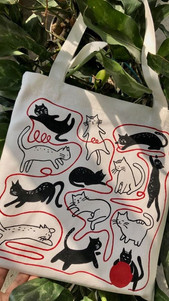
Bag research
I need to do a little research for the bag so I can work towards it into my sketchbook, this way I can get a better outcome.
Looking through online, and taking a look at bags that are already made- I tried to pick apart what makes that tote bag unique and why it works so well as a tote bag. Firstly, I wanted to note what is important to a tote bag design.
Researching, I found that knowing your audience is very important to deciding what is the best design is it'll help you plan what your illustration should have in terms of colour and subject. In my case, I am doing a nature event- spending time in nature; and I wanted the innocence of being in nature, getting lost in it's beauty and the memories you'll make. Therefore the main target audience will most likely the younger demographic but since it's such a broad topic, I would like to to be for everyone.
Additionally, the tote bag must be simple, confusing designs can throw off the bag completely-- say someone purchases the bag, as they move further away the tote bag becomes a mess as you'll lose what the subject of the illustration is.
Surprisingly, colour is very important, but not what I thought it would be for; colour is important for branding, recognizing the illustration alongside the brand colour is help you relate the two together and create great advertisement! Therefore, when I design my illustration I feel like I would have to stick to the greens and more earthy tones to represent the nature "event". 5
I took a look at someone painting tote bags on Youtube, and noticed the same similar pattern throughout other tote bags I've seen online, Simplicity; Simple line work making for a extremely eye-catching tote-bag.
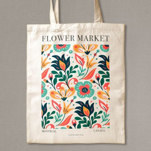
Tote Bag Board
Collecting inspiration for the tote bags, and to get an idea of what I should be aiming for.
Formatting and size
Looking into what the bags in terms of sizing, they all seem to flow the hidden square format, it creates a structure for the bag- especially since the bag itself hasn't got any shape to it (just a flat bag).


Sketchbook Walk-through (no commentary)
Sketchbook Walk-through (commentary)
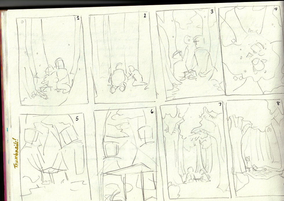
Thumbnails/Colour Tests


The painted piece (explanation of process)
Originally, I used the draft (last page of sketchbook) as the main idea, however as i was painting that piece I noticed it was lacking character and narrative; in the character design I made them opposite in their clothing and their pose- which you could get that result with the original draft. I stopped painting, had a took 30 minutes away and came back and thought about how to improve.

Therefore I started to think back to what my cousin's children were like as we were making their faerie den, and decided to make their pose more to their individual characteristic. Making the smaller toddler crouching (avoiding the dirt), whereas the other, older girl, is happy to sit in the grass.
When I produced the sketch I found myself enjoying the narrative and composition better than the original idea.
For this piece I produced on canvas, I started off with a light sketch before going in with watercolour so I can keep track of colour and block shapes before going in with acrylic paint.

Turning it into the illustration
Font
I wanted some slogan/quote on there and the most requested font was the 2nd bottom on the left, and so I used that as well as a thicker font for the wording underneath the illustration.

Next step
For the next step I created a clipping mask shape for the illustration to create that arching effect to finish off the illustration.

Mock-ups


Reworking
After that attempt, my tutor gave me some feedback that I would benefit the designs; so I used a cold press paper and I stuck with minimal shades/textures to keep the simplicity, therefore I used watercolour. I ended up reworking the design itself slightly, using the thumbnails as reference since I found it difficult to re-sketch the old design.
Formatting

I used liquid masking to keep the whites of the paper for the watercolour to avoid, and kept a similar colour-scheme to what I had already used but incorporated a blue into the young girls dungarees-- and adding a wash of blue for the background ever so slightly.
I did a font test, took a screenshot and lost the image as I try to find it, I asked for feedback from my Dad on which is best and he rested on the posh lettering.
Design before editing


Final Design: Mock-ups


Reworked version vs original


Feedback from friends
I wanted to ask which is the best design and if I've made an improvement on the bag itself- both friends agreed that the reworked version was much more made to the tote bag while the original would've only looked good as a poster, there's more clarity in the image and better suits the simplicity of the tote bag.
Evaluation
This assignment was very intense but it gave me a chance to improve my work and yes, I did improve; I spent time in my sketchbook improve skills, influence my artists into my work and eventually developing a design.
I was extremely happy with how the design turned out, there were many times where I thought I wasn't going to finish or I wasn't going to be happy with the result; and there was a lot of doubts, but after one trial and error- I recollected my thoughts and came out with a design that I was very happy with. In terms of the sketchbook, I feel like it gave me a bit of more confidence as well as more visibility to my mistakes, I was happy to make mistakes, I moved on and tried to combat it.
Using acrylic allowed me to rework the image over multiple days and dried quickly; I watched plenty of videos on using acrylic and it helped, I avoided the "muddy" colours of acrylic, I blended colours easily with a dry brush. I also learnt the prime my canvas (since I always forget), and sanded down the canvas for a smoother look, which helped a lot to put the paint on the canvas.
Using watercolour initially was fun, I just had a moment where I explored watercolour before going on top with acrylic; it would've been interesting to see how it would've turned out using watercolour paper and watercolour, would it feel more light and would I have been able to utilize the sketch into the watercolour- something that I wasn't able to keep to when using acrylic.
As I was designing, I created more interesting thumbnails with perspective and made a interesting character design which included posing to show their personality- I was so happy with the character design that it made me want to explore watercolour and character design more.
Next time I would like to divert to watercolour, after that character design I was really in the mood to create the illustration in watercolour- however, my sketchbook had more acrylic studies and straying from the medium into the final work would make the sketchbook to final piece lack flow.
Overall, I was able to create a piece of work that I'm confident about with the sketchbook's help; using a sketchbook allows you to explore a variety of mediums, ideas and allows you to reflect on what you've done and how you've evolved.
Continued update evaluation
After reworking this piece and adjusting this learning log, the improved illustration looks much more interesting and to the branding of "being in nature", it's got a better format, there is more clarity in the image.
The original isn't bad but it isn't well-suited for a tote bag since it has too much going on; the new version is done in watercolour too, since previously I said I would look to try the illustration in watercolour-- and I feel like it is better for it, it's more warm and nostalgic than the original.
Reflective Statement
Overall, I feel as though my work, style and attitude has improved a lot of this course. My observational skills as improved as I explore life which in turn has improved my drawing skills, my painting has slightly improved as I discover different techniques and surfaces. Lately, i've been exploring traditional and fantastical artists and styles which has molded me into what I would like to explore a bit more.
My experimentation haven't changed as much since I've reduced the amount of mediums to try, concentrating on a few mediums more in depth; there's a lot more expressive and fluid mark-making- especially in some of my sketchbook (assignment 5), as I aim for a looser and expressive style of drawing.
Exploring different artist and their sketchbooks have helped extremely as I explore and discover what type of artist I am, and what art I would like to produce-- all that, without judgement. I used to always compare my work to others and more recently I've been adopting the saying "this is my journey, that is theirs. So there is no point comparing".
I've been showing more of my artwork to others, connecting with other artists at Comic Con and meeting amazing people; which has allowed me to hear what it took for them to get where they are and what they love to do.
For every reflective summary that I have done so far, I say on the lines of how 'this year has been an artistic and personal journey', which makes me realise that art and my life are meant to be and I wouldn't know where I'd be without it.
This reflective summary makes me so excited to see where the course will lead me to next...
1 Submarine Channel, Youtube 'Fantasy artist Iris Compiet on how to kickstart your illustration career', Nov 5, 2020. https://www.youtube.com/watch?v=s0oGQENxm4s Accessed Sept 2, 2023.
2 Iris Compiet, Youtube 'sketching a horned one', May 25, 2020. https://www.youtube.com/watch?v=Vv_VRki-v9g Accessed Sept 2, 2023.
3 Artnet, artnet Joaquin Sorolla, U/A. https://www.artnet.com/artists/joaquin-sorolla-y-bastida/ Accessed Sept 2, 2023.
4 U/A, National Gallery 'Sorolla:Spanish Master of Light', U/A. https://www.nationalgallery.org.uk/exhibitions/past/sorolla/what-you-need-to-know-about-sorolla Accessed Sept 2, 2023.
5 U/A, GarmetPrinting 'How to Master A Tote Bag Design in 6 Simple Steps', U/A. https://www.garmentprinting.co.uk/blog/how-to-master-a-tote-bag-design-in-6-simple-steps/ Accessed Oct 13, 2023.
6 PearFleur, Youtube 'Painting Totes Bags 📝 ✣ [art process to relax/chill to]', Dec 11, 2021, https://www.youtube.com/watch?v=A4uK260oWo8 Accessed Oct 13, 2023.


Comments