Assignment 8: A Moveable Book (A 'Lift-the-flap' Book)
- Abbie Vidler

- Jun 29, 2025
- 5 min read
Aims
I chose the 'Lift-the-flap' book version of this assignment; I'll conduct research, develop the overall plans, thumbnails, font and story, then develop the prototype. It must be children's book for 3-8 years old.
Research
I looked into three 'lift-the-flap' books to get an idea of how the designs are integrated together with the interactivity of the book, especially those aimed at 3-8 year olds.
We're Going to a Party! by Jeanne Willis
This book played around with the idea of animals dressed up, unveiling different animals. The designs are fun and simplistic but very effective at making an entertaining children book; interestingly enough it is also a pop-up book for the ending. The cut-outs are shaped by the costumes of the animals, with peeks of what's underneath to get the reader intrigued. There is more text which implies its for the upper range of the 3-8 year olds, and the font is clear and readable.
Saturated colours are used and the overall space around the flaps are quite bare so that it's not too distracting to the reader, the text flows along with the flaps and are on the other-side of the flaps to progress the story.

Where's Spot by Eric Hill
Simple design and colours for this story, where the story takes us to find Spot the puppy, this book showcases animals hiding away in various objects. This design is also simple with line-work and colour and the text is short and sweet, which would imply it's for the younger part of the age bracket. The font is quite large and simple.
The use of flaps in this story are used for objects and tend to reveal animals hiding away in different areas, when the animal is revealed they tend to say that they're not spot-- getting anticipation for the reader to find Spot.

I'm Going to Eat You by Agnese Baruzzi
For this story, readers will learn about the animal food chain, design-wise it's more abstract with the shape and textures, very little line-work and very simple text. There is very little text (with large font) for the main story which implies its for the younger age, and the shape of the book is square and the flaps fold outwards compared to the previous books.
A landscape/setting is shown on the first page, then the bottom page will show to an two animals or an animal and a plant, then you fold it open to see several animals, following who eats who. It acts as an element of curiosity and surprise when readers see what different animals eat or get eaten by.

Look Inside Seas and Oceans by Megan Cullis
This book takes you through different oceans and seas and takes a look at all the animals and creatures that reside in and around them. There are no main characters in this story as creature is represented equally.
The text has more information in them and the font is still readable, the amount of text tells me that this is for the older age group of the 3-8 year group. The flaps work to reveal more information and other hidden illustrations that will help the story.
The illustrations have a lot of colour with different colour schemes to represent different areas of the world, the colours aren't bold but they are very saturated. I really like the textures that the illustrations have with the pencil fall off that is used when using a pencil traditionally.
Compared to the previous books, this book has a lot on each page, it's quite crammed with illustrations and text which could overwhelm the younger part of the 3-8 age group.

Idea
Ever since I started this section of the course, I've been writing down story ideas for inspiration to go back to. When this assignment said about doing a children's story I knew I wanted to create my only children's story idea.
I had two characters Pip and Mel; I wanted them both to be endangered animals based in the UK to bring awareness to the species. The original story had Pip feeling exhausted as he journeys back home before he hibernates, he stops at a small lake and is feeling tired when Mel comes out her home with freshly baked treats-- they sit and eat tarts and drink teas which helps Pip. Pip thanks Mel and heads home. Hopefully teaching young children to know when they need to calm down, or relax, and to teach to be kind to everyone.
Something along those lines, however I need to incorporate the flap mechanics into the story, maybe help Pip put the bag down, opening the door for Mel, surprise bakery treats.
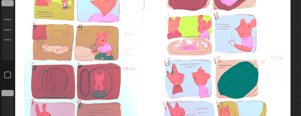
Sketches
Starting out with sketches of the animals that are in the story then pushing them into character designs. Then I developed story elements, and then I had a little fun sketching the characters and captured a really fun style which finalised the design; from there I created thumbnails for the story pages.


Colour Tests
I ended up aiming for the last photo of the slide.


Process
After the planning process, I got watercolour paper and sketched out the illustration on small rounded square paper-- I wanted to create a story that is small and portable, resembling that of a the small Beatrix Potter books.
After sketching out each design, I took a brush ink pen and did the outlines, once done I used watercolour to colour in the designs. For the flap elements, I preplanned what story elements I wanted (and explored a bit with simple narrative elements), I took the outline of the shape of what the fold was or the surrounding area and cut out the shape, then coloured it.
I added the simple text around it, keeping it simple and readable as possible for a prototype; I used masking tape to bound the book together loosely.
Prototype
Evaluation
For this assignment, I had to create a 'Lift-the-flap' Children's Story, developing a flat design of the concept and story together-- and to go the extra step I made a physical mock-up of the book. I had fun with this, developing a story that I had in my head for a while and I had a lot of fun with coming up with way I could create simple narrative pushes with the flaps.
Something as simple as a breath made the book simple and interesting, and I am really glad I went with a small portable design-- when asking for criticism from family, they said that they like the size and thought that the overall design was really good (which I was very surprised with).
I tried to create the same colours, the vibrant one that I choose from the colour thumbnails but I struggled with the watercolour to keep up the amount of colours that I had to remake and keep consistent. Though, I have heard that Gouache is really good for vibrancy and consistency, so maybe that is something I need to experiment with next.
Personally, I am extremely happy with how it turned out and makes me a little sad that this little book isn't going to be turned into a real book that people could read, but it was still very fun none-the-less.
1 Willis. J & Ross. T, 2014, We're Going to a Party!, Andersen Press.
2 Hill. E, 2009, Where's Spot, Warne.
3 Baruzzi. A, 2016, White Star.
3 Cullis. M & Luu. B, 2019, Look Inside Seas and Oceans, Usborne Publishing.


Comments