Assignment 4: Building Stories
- Abbie Vidler

- Aug 19, 2023
- 11 min read
Updated: Oct 21, 2023
Brief
Before you begin, it will be useful to remind yourself of your reflections on the exercises you’ve completed so far. Go back to the beginning of the course, to part one, where there are instructions to create a foldy zine. For the assignment, you will be required to make and complete a full ‘foldy’ zine style sketchbook which develops a narrative across a minimum sequence of six stages.
Use one of the ideas you’ve played with in your sketchbook during part four as a starting point for developing this narrative. Remember this is just a ‘starting point’ so if you need to go out again to observe something more closely, or to draw in greater detail, then you may do so as a part of the process of iteration or reworking, remaking and refining your work. All of the sketchbooks created to date you should have made throughout the course so will contain drawings that could also be valuable at this stage so look to carefully review everything with a mind to what fragment of an idea might be worth developing into a very short story.
Choose from the stages below that you were introduced to during the research task above. You are going to build a narrative - this could be a simple, everyday story or use the basis of the everyday to imagine a more fantastical or extraordinary sequence of images.
1. Stasis
2. Trigger
3. Quest
4. A surprise
5. A critical choice / a reaction
6. The Climax
7. The Reversal
8. The Resolution
Your story structure for exercise 4:4 may be perfect to build on for developing this visual narrative of sequential images but you may decide to go with a new structure.
You will find it useful to use your sketchbook as you plan each page by making quick sketch plans or ‘thumbnails’ of the basic imagery which forms your narrative. Make sure you plan the images across the 8 pages of the book, considering how they work in relation to each other within your proposed sequence.
Decide if you would like to use any wording to accompany each image, and if so think about, what the relationship and function will be between the words and images as well as where you will position them. They could be used illustratively, drawn and embedded as part of your images, or they could be positioned on the page with your image. In each case you will need to see them as a visual element that has weight and that will impact visually on of the overall reading of the images and flow of the story. What this means is considering the words as an aspect of the design, making an aesthetic decision about them , as well as establishing their purpose within the communication of the narrative.
Planning
I started off with a tiny little mind map, outlining some basic ideas. There is so many ideas I want to explore, and as I write this now, I want to jump straight into another idea. However, so I stay on track, I am going to explore a story idea based from my friends and I's D&D sessions that I host.
I felt like as I researched more into zine and how easily accessible zine are, I wanted to (possible) make them after every D&D sessions fortnightly. Doing this also gets me to explore narrative further, as well as explore artistic styles-- since I've been in the habit of making everything realistic. This is because of a page-spread that I did with watercolour in the woods, it's not realistic but it gets me out of my comfort zone to explore a newer style.
In the mood board below, I've found an artist with a style I would like to explore with that use of watercolours and the fantasy theme. I've also included some beautiful paintings since I found the lighting and colour inspiring, and made me think of practicing colour and light before jumping into this assignment. I've included the drawing observations of some old-timely men since I love the style, the use of mechanical pencil and line-making.
I've also picked out a font that really jumped out at me, it's trendy, it fits the aesthetic of a zine-- as well as fitting the genre of the story. In the image below (the mindmap), I've included a brief writing of what happened (the highlight of the D&D sessions and included one moment which I could possibly use for the zine.
You can't really see it but I've included a to-do list in the mood board as well as little things that have jumped out at me.


(Click to get a bigger view)
Artist Research (Christophe Ferreira, Watercolour tips and John Tenniel)
Christophe Ferreira
I couldn't find much on Christophe Ferreira therefore I assessed some of his work to get an idea on how he uses watercolour and ink to create the powerful sketched illustrations. Ferreira loved anime and studied Graphic Design because he was unaware of any education in comics and animation, until he realised what he wanted to do and pursued a career in manga and anime- while living in Japan. 1

Assessing his work, I can see that there is an attention to detail in his sketch before he goes in with watercolour, and it would seem that he uses ink to outline the foreground (the background having minimal or no outline to show the depth of the illustration). There is some application of watercolour lines, not just the inking, an it gives the illustration a softer look. (2)
There is an beautiful use of colour, using blues and greens for the shadows to give the illusion of dark and light in the illustration (like below), while using warmer colours where there is light hitting the surfaces. Similarly to the video I've attached below (watercolour character design) it would seem that he uses red watercolour or pencil to lay down the sketch, so you can easily disguise the lines and have a more fluid and depthful illustration.

(2)
I wanted to improve my watercolour skills when it comes to characters and this video was extremely helpful. A few tips that I got from this video was to keep the sketch light, and then go over it in red watercolour (and actually let it dry, don't rush it). This makes the illustration more warm and avoid any horrible dark lines in the characters.
I also noticed her varying in line weight and additional use of lines, capturing the flow of a material with the lines lightly with red watercolour so it's easily able to go over with another colour to add depth. Moving to colour, she gave a helpful tip that I must do, take your time with colour. Absolutely vital, I always rush into it, so seeing her results and her time management, I see that it's important to take my time and not get carried away with getting it done.
Lastly, adding details and keeping focus, she uses a precise brush to get in the details, like capture the edge of the nose or adding the flow of a material.
In my own time and as I paint, I will continue to look at tutorials or 'paint with me''s to remind myself of what to focus on when I'm making my illustrations, since I really want to train my brain to think about light and colour in my illustrations, since I've been slightly improving my people illustrations.
John Tenniel
A well-renowned illustrator known for his illustrations for Punch Magazine and-- of course, Alice in Wonderland. John Tenniel has an incredible use of line-work, mark-making and movement in his illustrations; the way he uses lines to create the movement and shape is astounding.
Personally, Tenniels' fantasy illustrations are a lot more feminine and flowy than Frank Frazetta's work, sine I was tempted to research Frank-- however, I found it too masculine and bulky to suit me. There is an effective use of cross-hatching in Tenniel's work and creates a beautiful sense of depth without the use of colour.
Tenniel developed this style after observing from life (just like I should be doing, and have been recently), and learning specifically from stage performs as they dramatise their movements or their facial expressions. Because of this, I may briefly explore some videos online of stage performers and sketch them to see the improvement in my work, then draw from life in a public place. One thing that I don't have (which I really wished I did), Tenniel had excellent photographic memory and was able to capture the same character multiple times after limited viewing,
With influence from, "stealing like an artist", I would love to develop Tenniel's use of linework, the amount of detail the illustrations have is breath-taking and my work is very flat in comparison, so it is definitely something I want to have in mind for my assignment. 4

(Frog-Footman and Fish-Footman holding an invitation, 5)
Drawing People/Landscape studies


Character Designs/ Teapot Design/Watercolour tests
My friends already made their characters for the campaign (below), and I just wanted to test out watercolours and flesh out the faces of the character designs.
(The duck is the main character (third image))


Thumbnails/Drafts


I had to cut out two of the other characters since 8-pages aren't long enough to reference them without getting confusing. I used a post-it to change up the panels, playing around with perspective and composition.
Process
Starting off with watercolour, I scanned the image and inserted it to procreate for colour balance and adding text.
The Completed Zine
I wasn't happy with how it turned out and wanted to take the same sketched I made for the watercolour and created it digitally.
Remaking it digitally
Testing Papers
I wanted to explore different papers to see the fold-ability, the colour matching and the paper texture.
Matte Paper
It made the colours darker and it was very difficult to fold up, very bulky, but is a nice texture.
Gloss Paper
Almost perfect colour matching, extremely difficult to fold and the gloss is a nice effect-- but it's way too bulky.
Printer Paper (black and white)
I wanted to test out the effect of monochrome with printer paper, purely for exploration purposes, it looks interesting and cost effective.
Printer Paper (coloured)
Very easy to fold and thin, although the colour is much more lighter and shapes are harder to distinguished.
Printer Paper (boosted colour)
Since the printer paper was easier to fold and wasn't bulky, I wanted to boost the colours so I turned up the saturation a lot and increased the contrast and sharpness-- and it does look much better.
The final iteration

Evaluation
This assignment initially started off very strong, I was so happy with the character design, I was really excited with the research (feeling really optimistic) and I was really excited to use a story that happened from our D&D session; however when it came to doing it I couldn't translate what style I wanted into my work.
I actually originally started off with doing several watercolour panels individually, but the work was so bad and the watercolour was awful-- I felt extremely disheartened because of this and I went into it digitally just to try and finish in time. After printing the digital versions multiple times, I still wasn't happy with how it turned out, so resulted to looking back at my work and picking the best one. The reason for saying I did watercolour first then digitally was purely to reflect on my research, since I did start with watercolour but went digitally-- not happy and looked back at my research, then going to watercolour again (which failed).
Very confusing.
If I avoid being too hard on myself, I feel like some of the panels are fun and interesting-- the drawings of the characters have shown my improvement of people drawing. Testing different papers allowed me to pick the right one for the zine, and experimenting with watercolour and digital has allowed me to have a stronger outcome (considering how bad it looks).
I used my learning from these exercises: using basic narrative structures, conversation with pictures and interpretation and communication. All of these formed the foundation of the little comic zine.
The colours somewhat collaborate with each other, I wanted each character to have their own colour but I notice now that Liam's character (Orelith, the one throwing the axe) blends in with the background a lot. It all feels too saturated, and I prefer the watery effect of the watercolour, but I like the control of the digital.
I really wanted my work to be as stylised as Christophe Ferreira and John Tenniel, however, I'm probably not at the level yet, which is very lackluster.
Next time, I would like to really push the watercolour, and have bigger watercolour paper- create a detailed sketch and use watercolour to get the idea I want across; I want detail with washes of colour that I wasn't able to achieve.
Overall, I tried so hard to make it how I pictured it but it fell short. I'm disappointed in myself...
Reworking
After receiving tutor feedback, I decided to redo the assignment and use the feedback to better construct my zine. The main focus' of feedback was to use the watercolour since it added more character, add a variety of different compositions (close-ups, etc). A personal feedback that I had about the comic was to include more characters into the scene to give it more life.
Script

Planning
I wanted to utilize some scenes that I have already used and expand on them further, adding a few comical moments to show emotion in their poses/expression-- adding close-ups of the face and a top-down perspective to show the height of the scene. I also wanted to create a height effect for when the bubble would be popped, therefore adding a long format of panel.

Watercolour pages


Font
As I was writing up the speech bubbles, I played with the following fonts but ultimately went to 'Porcelain' font for the main text speech, and 'Noot' for action words; for the main title I used 'Sunborn' and 'Canva Sans'.


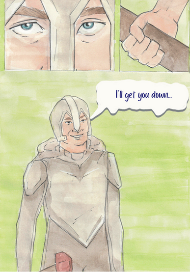
Final work


Evaluation
Working on feedback given from my tutor and personal changes, I feel like the outcome is much stronger, adding more narrative allows more time for the reader to take in the comic. The poses, composition and more popping colour of sound effects really helps push the narrative, it's more pleasing to read through and is a great little comic zine.
Using watercolour as the final work has allowed me to use that influence from Christophe Ferreira, it gives the zine more character and isn't as flat as the digital version; however it still isn't as detailed as John Tenniel's work, but I do want to improve on adding more details into my drawings.
I made use to add a little blue colour around the speech bubble for when the two characters are inside the bubble to help influence that idea that their voice would change due to their situation. I've also added a cool top down view in the third page to help give the reader an idea of how high the bubble is. On top of that I've added a nice reaction shot from the two characters, just so show more emotion in the faces and for comedic value.
Reflection
So far, I've really enjoyed drawing, and coming up with ideas. I've enjoyed how this section made me go out and draw, like going out for a coffee and sitting for 4 hours drawing away contently. I've also enjoyed seeing my work improve, seeing how I've slowly (still needs work) started to think creatively.
I've gotten a bit more confident with my drawing ability, to the point where I revisited an old character I made from the last elective and created an illustration- where the result was so much better than the previous illustrations.
By including writing alongside sketches and illustrations I've been able to look back and come up with bigger ideas or reflect on what happened while I was drawing.
I had fun with moving from descriptive drawings towards fictional narratives, it allowed me to reflect on newer approaches to narrative illustrations by being more stylised and creating better outcomes (like drawing people better).
Researching a variety of different illustrators has allowed me to have a broader perspective on what illustrations means, or what it means to be to be a good illustrator. I still have a long way to go to get there, but I've taken the first step into being a better illustrator.
1 U/A, Europe Comics 'Christophe Ferreira', U/A. https://www.europecomics.com/author/christophe-ferreira/ Accessed Aug 14, 2023.
2 C. Ferreria, Tumblr 'Christophe Ferreria' 2018 (image. 1) 2017 (image. 2). https://lebuta.tumblr.com/ Accessed Aug 14, 2023.
3 M. Tiurina, Youtube 'Charater Design watercolour practice process', Nov 12, 2021. https://www.youtube.com/watch?v=GMzxTxvdl1k Accessed Aug 14, 2023.
4 U/A, V&A 'John Tenniel - an introduction', est. 2021. https://www.vam.ac.uk/articles/john-tenniel-an-introduction Accessed Aug 14, 2023.
5 U/A. Alice-in-Wonderland.net 'Alice in Wonderland in pictures', U/A. https://www.alice-in-wonderland.net/resources/pictures/alices-adventures-in-wonderland/ Accessed Aug 14, 2023.


Comments