Assignment 4: Testing the Fit
- Abbie Vidler

- Jan 21
- 7 min read
Brief
From the opportunities you identified in Research Task 1: Situating Your Work, choose one that you feel is a strong fit for your illustration practice.
For this assignment, you can take that one step further and create a piece of work (or a small series of works) specifically for that context.
Begin by reflecting on why you have chosen this context over the others you researched - how well do your subject matter, aesthetic sense, and tone align with its audience and purpose? Think about how your values match the ethos of your chosen place, and remember to take into account any practical constraints such as format, budget or deadlines.
Choose a piece of work, and adapt this into a new illustration/series of works specifically for this chosen context, making sure that the work feels natural and relevant to the space and the people who will encounter it. This could be an actual piece intended for submission, or a mock-up showing how your work would appear in that setting.
Your aim is to show that you understand the audience, the space, and that this is a context that you genuinely connect with. This hopefully feels like you’ve found a place - a space and a community you’re excited to be a part of, and you’re creating work that belongs naturally in that world.
In your Learning Log, explain how your earlier research shaped the decisions you made, how you have adapted the work to suit the context, and whether you feel it truly fits, both creatively and practically. Are there any changes you might make?
Reflecting to Situating Your Work
To tackle this assignment I have to use what I previously researched and decide what avenue I should go down for this particular assignment. Bouncing off of the research task and with the recent Turner Miniatures Exhibition Talk, I think I might approach this task with Book Illustrations/Book Design; with the influence of Turner's use of watercolours, I want to approach this task by using watercolours for a couple of front covers.
I chose the London Book Fair over other ones chosen because I wanted to take the chance to see if this is an avenue my work could go into, I'm hoping that I can show versatility in skills with the different style approaches that each of the stories has.
Research and Aim
Worlds in Miniature | J.M.W. Turner’s Vignettes (online)

I attended the online talk of J.M.W Turner's Vignettes talk where I got to take a deeper look at Turner's work, I got to see the vignettes that were used as book illustrations for a poetry books. The designs were truly beautiful and felt really natural, it did make me wonder if books today have illustrations like this one (right).
Seeing the artworks and listening to the talk, it got me thinking why I don't see many illustrations like these in books today. You have graphic novels, comics, zines, manga and children's book-- but not many books outside of those have illustrations like these.
The illustration would be created in a very small format in watercolour then be converted into a engraving to be pressed into books.
Maybe my illustrations can capture that essence of story the Turner had; my aim is to create a series of book covers that can effective convey story.
My assignment will be based off the idea that my work would be seen at The London Book Fair.
I wanted to make sure I was prepared with this task and so I looked at Andrew Loomis' Creative Illustration.
Composition
There are many ways you can set up composition, you can make up a composition based on letter and symbols by having subjects or places set up with that letter/symbol in mind (pg. 32). There's also composition based on objects-- whether they're smaller, larger, or if they're heavy or lighter (pg. 34).
For my symmetrical illustrations, the "formal subdivision" composition works very well, this one is usually made up for murals and other large surfaces since it helps divide up and line up where things need to be places (pg. 35).
You can set up a composition based on how much light there, what textures there are
There are many more ways you can make composition work, it's all about understanding where you want your eyes to go, what mood you want to set up and what story you want to tell.
The main thing that didn't work with previously made book covers was composition and style; the 'Republic' cover loses it's composition since the lighting isn't effective, the 'Animals Around the World' cover style is flat and boring, and the 'Head in the Clouds: Daydreaming' has a lot of conflicting elements that mess with the overall composition.


Mood Boards


Going into this assignment
To create my front covers, I am going to revisit old pieces of work and produce the front covers, I've been looking at my old work that showed my beginner skills and I would like to use this opportunity to see how far I've come.
Below is the works that I'll be turning into front covers, my sci-fi slice of life, a manga, a fantasy comic, ana a zombie comic.
(Project One- First photo); will be ink pen and watercolour.
(Project Two- Second Photo); will be in ink pen and digital.
(Project Three- Third Photo); will be in watercolour, ink pen and digital.
(Project Four- Fourth Photo); will be in ink pen and digital.
I wrote these in mind that I'll try a variety of different way to approach these designs in a way that can show my skills, and to hopefully show my improvement since I made these.


Thumbnails/Sketches


Watercolour Colour Thumbnails


Process
Scans before editing and colour


Digital process for front covers
Font


What I did
For all of these illustrations, I started out with a simple sketching graphite pen, then went over it with an brush pen using ink, for the ‘Finding the Rhythm’ book illustration I use watercolour in a monochromatic colour scheme. For the ‘Prosperity’ book illustration I used watercolour coloured pens and coloured pencils. For the manga, I took the illustration into Procreate and used a limited amount of colours and created the format in the style of a traditional manga. Lastly for the zombie comic, I used ink brush pen and used half tone effects to create a traditional comic style.
Final Work


Presentation

Evaluation
For this assignment, I had to choose a previously researched fair that I would like to attend and create pieces of work that would suit the environment I chose, I wanted to take the opportunity to revisit old work and use the skills I’ve got today to improve on and create book covers.
To approach this assignment, I used watercolours, ink pen and digital, these are my most common mediums to create my art with. Once complete, I arrange the front covers and my business card together to create a presentation that would be used for the book fair illustration.
I am surprisingly really happy with how each of the book covers have turned out, they all have a distinct look to them that makes them stand up from their own.
Finding the Rhythm has the most interesting look to them with soft lighting and limited use of colour palette, rather than a black ink I used a grey to keep the illustration light; I feel this best suits the drama and romance the story holds in the concept and original ideas. I tried really hard to create an interesting perspective of the subject to improve my drawing skills, and I feel this helped the mood of the illustration. I’m especially happy with how the highlights and light of very illustration adds to the emotional effect of the front cover.
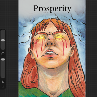
After having a second chance of revisiting Prosperity, I wanted to improve the front cover doing so with watercolour coloured pencils and coloured pens, I wanted the main character to be the focus of the illustration to show the readers that this is a story we’re listening to. I want the audience to understand genre therefore I didn’t magical elements to the eyes and adding to the mystery of white blood is coming out of her eyes.
No Hope: Beginning is an attempt at revisiting a very old assignment that I did at the beginning of this course, I wanted to take the story and create a front cover for it. I ensure that I used the same materials from the original with the brush ink pen and digital medium, I wanted this cover to capture the horror of the zombies rather than the main characters since this is at the beginning of the outbreak.
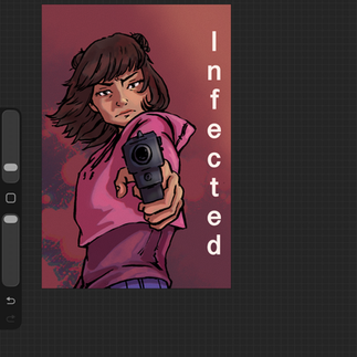
Infected, the manga, was a recent illustration but fell in love with the manga format after completing the original, I wanted to take the inspiration from the mood board of other manga and use it to help give ideas to the composition. Typically the main character is the focus of the illustration and the more issues come out the variety of characters are conveyed on the front cover, hence this style for my book cover.
For the presentation, I wanted it to be clear concise and eye-grabbing, I laid out the front covers and my business card then added simple text to give a brief description and age rating for the book covers.
Overall, I’m really happy with how the front covers turned out and displays well on the presentation board.
Looking back, my research helped me understand what direction my illustration should go format-wise and what my audience wants to see for the front covers; I feel that the illustrations suit The London Book Fair as the presentation is clear and readable whilst providing important details for people to see.
Creative Illustration: Andrew Loomis, 1947. The Viking Press (New York).

Comments