Assignment 3: Illustrative people and places
- Abbie Vidler

- Jun 28, 2023
- 11 min read
Brief
Your exercises and research tasks have given you an opportunity to visually explore places and what people do within them. You have used observational drawing as visual research, and explored the value of sketchbooks within the process of idea development and also in the generation of ideas for illustration. Assignment three will bring this work together. It is split into two sections, the first explores visual research as a way of both collecting visual information as well as to create drawings that could be applied to a specific context to function as a piece of illustration. The second part of the assignment focuses specifically on the development and application of the understanding gained through the reportage process.
1. Visual research Think about the way you have already used your sketchbooks to document and respond to the everyday, by observing places, people, and activities. You might want to go back to one of the places from your route or choose another location or event. As before do some sketches that collect information about the figures and what they are doing, the location and any other elements that you think describe an activity or place. Consider lighting, the weather conditions, the season, the atmosphere or the mood. As before these reportage drawings could focus on activities as ordinary and everyday as people carrying shopping, rushing from work, lingering in a shopping area, sitting on a bench enjoying the plants in a park, chatting in the playground as they wait to pick their children up from school etc. If you have decided to go to a specific event or location where a specialist activity is taking place, such as a dog show, a farm, a sports event or a concert try to gather as much imagery as you can. In the same way that you practiced drawing objects quickly in part one, this is a chance to see your drawing as fast information-gathering pieces of visual notation. Some of your drawings may be more considered drawings, or descriptive in other ways. They may have more detail or focus on one particular aspect of a scene in detail when the overall image may be sketchy or gestural. As before, add notes or words too if you think this will give you more information or if you think they will add another aesthetic dimension to the image.
Use your learning log to reflect on:
• Which drawings you see as pieces of visual notation.
• Which drawings you see as possible pieces or reportage as they already exist.
• Which drawings you would like to build upon further, in your studio.
2. Developing a narrative
This option gives you a chance to take some of your drawings and develop them into a more narrative piece. Firstly make a note of some words that you want to focus on and to use as a basis of your illustration. These could be descriptions of the place, adjectives relating to your impression of it, or facts if it is historic or cultural importance. If you think about possible headings for a poster or editorial they might provide a narrative direction.
An example of this would be a simple statement such as:
• Enjoy……..
• Spend more time doing……Opera singing /Hastings/ice skating /dog walking/window cleaning/baking/rainy days/ bingo/Window shopping/ sleeping/knitting You should take one of the drawings you have already made on location or think about where you will go to make another.
The aim is to deliberately create a piece of reportage that uses the combination of figures and location to describe an activity, building the sense of narrative that is lent by the words you have chosen.The elements might be connected or taken from different sources and put together. It doesn’t have to be a real event, or a momentous one. Think about how you use materials and ways of drawing to best suit the context and build a narrative around the chosen words.
Choose one of these possible uses for your drawing:
• A poster to promote an event or activity
• An editorial illustration in a newspaper or magazine that describes the event or location
• A historical piece in a textbook for children that would be relevant to your location Consider which aspects of SCAMPER suited your creative process, as you work towards adapting and building upon your existing sketches. Think about how to develop the drawings for the context that you choose. If you have encountered any stylistic approaches that you have enjoyed when looking at other artist’s work, or feel inspired by them to try particular media or colour schemes, this is a good opportunity to experiment within the realm of visual language. Don’t worry if you don’t make a final piece of artwork that is resolved or refined. Instead use the sketchbook to document the process of visual enquiry for your chosen uses of the imagery.
Visual Research
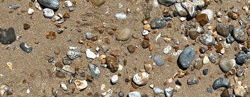
I did a page spread on my day at the beach, I also took a few pictures to capture some of the moments that we're fleeting; as I was drawing and taking in the day, I started to think about what the outcome of the illustration could be. Seeing people enjoy the weather, spending time with family and escaping their daily life. It made me think about how precious it is, I wanted to pour everything into the illustration.


In the time of doing some visual research and doing this assignment, I did a little painting study and produced the piece below by imitating the famous painting 'Girl with a Pearl Earring' by Johannes Vermeer; and I was think how I could influence it into my illustration, maybe doing an acrylic painting for the illustration, or creating the illustration in a traditional painting way.

Which drawings you see as pieces of visual notation?
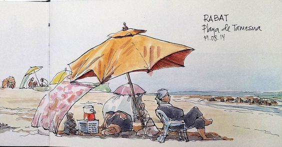
The drawings that jump out to me the most during visual research are the drawings of people, the relaxed poses, simple walking-- with a dog or putting their feet into the cool water. The drawings of the gliders out at sea jumped out to me too with its movement; I drew two guys setting up a glider with a paddle and added a little narrative with speech bubbles.
In terms of planning for the illustration, I could see all the sketches being incorporated-- planned out on a canvas but developed further with colour and maybe including some narrative elements.
Which drawings you see as possible pieces or reportage as they already exist?
I see the people and all the activities they are doing as potential pieces, I could just put them onto one page and call it an illustration; however, I really want to push my skills as an artist.
Which drawings you would like to build upon further, in your studio?
The other sketches of people actively doing things are the ones that interest me the most, instead of the ones where they sitting still aren't very eye-catching.
Research
I wanted to get a really picture on how to approach the design and the overall aim of the illustration, and I picked out some of imagery from Pinterest to stir up some ideas.


I like the long spread of the last image seeing everyone enjoying the beach and I would like to experiment with shape and lines, getting flowing natural effect. I've been personally studying Art Nouveau and I like the flow lifework, so I would like to see if I can incorporate.
An artist I found that does imagery like this, and picked up some elements of their work that inspired me when I first saw it...
George Butler
An illustrator and reporter using inks and watercolour to express who covers topics such as climates issues, social and political crises; taking a look at their work, the one that jumped out the most was his illustrations 'Stuck in Belgrade' they're very dark in colour with pops in colour and dynamic use of light.


Looking at these illustrations, what stuck me the most is the dynamic use of space, whether if it's filled with colour or left blank, it really draws you into the illustrations. What ideas that churn in my head is to include the long landscape shape but have lots of space, maybe do a beach with people on there-- including the length of the sand and sea.
Developing the illustration
Mind map and thumbnails
I really liked the length (landscape) ratio from the mood board and I wanted to play with that a little bit, incorporating Art Nouveau flowing attributes to it. I did play with other aspect ratios but I really latched onto the playful long canvas.


Colour Picking and tonal study
I played with blues and oranges to capture a strong sense of colour combination and value; and once I was set with the blue and orange tones (without the red undertone). Then, I went onto a tonal study which will enable me to be prepared on how to approach the final illustration, understanding the tonal values will help me see where lighter and darker colours will go resulting in a well-read illustration.


Sketch and painted illustration
I added a boat and played with the characters at the bottom for a better composition, I wanted the illustration to lead you to the sea-glider and set you off into the beautiful blue sun with the sun. I moved away from including sand (that was one the left side of the canvas, seen in the colour profiles), as it took away from the composition and was distracting; I toko influence from my sketchbook and added the dog that was walking with the guy and added a child next to the dog, I hope in doing this it would promote the 'Spending time with Family' to the illustration.

I used acrylic, something I'm not hugely confident in using but I wanted to explore the traditional medium as I have previously with the painting study (which I also used acrylic). With using Acrylic I was able to layer lots of colours on top whilst maintain the blue undertone washed I used, I used a wash undertone so the illustration could feel like it all was seamless in colour combination. I sometimes found it difficult to layer with the use of brush-marks being seen but with more layers and additional digital help I was able to smooth out intended areas.

Scanned Image

Playing with the final piece


Final Piece

After asking around, I got more votes on the natural colour scheme and I was so torn between this and the drastic blue colour scheme-- however, this seems more lighter and has more of the mood I want.
Mock-up (Magazine)


Provided by SmartMockups
Evaluation
This assignment overall has been really interesting to do, the intended purpose of this assignment was to incorporate my sketchbook visuals to create a poster/illustration promoting an event/activity/place. I decided to revisit the beach to sketch and instead of going to Dungeness, I went to Camber Sands instead since I wanted to go somewhere slightly different. From what I gathered, I found myself drawn to people moving and had an interest in the kite surfing; the day I went there was lots of people paddle boarding and kite surfing-- as well as swimming and walking their dogs.
I did some sketches and took some pictures-- however, looking back I feel like I didn't use much influence from the photos, which is a little disappointing. Sketching the best that I can and drawing up some thumbnails really helped with the outcome of the illustration, I wanted an illustration that flowed and had some influence from some personal research I've been doing on Art Nouveau. Playing with colour and tones has allowed me to carefully construct and create a cohesive and pleasing illustration that refuses to be distracting in colour.
With my research of George Butler, I discovered the play with space and was able to use that to help my composition flow, giving lots of space in the sky (around the kite surfer); it gives the illustration a little depth. Reflecting back, I was disappointed that I wasn't able to capture that painted feel of the Vermeer painting study, however, it has slightly improved my painting skill.
I originally planned to have everything in a blue colour scheme with simple orange accents, however as I painted I realised that it would feel too abstract for my intention and would blend in tonal values; looking at the final piece, the people painted really adds to the composition and improves the tones of the illustration.
What I would do next time is to try without the sun in the sky to see if that adds depth and space, I would also like to see if taking the dog out will improve someway-- but would prefer not to.
One thing I would like to try, recently I have experimenting with colour and tones in my previous works and would like to really push the abstract side of this illustration; the illustration works well at promoting the seaside and sea activities, but to play with the illustration could make it an interesting artwork.

Quickly doing some changes to see what it would be like, I immediately regret the outcome of the change (getting rid of the dog and the sun); it looks empty and lost in composition, but I'm happy that I gave it a go to see if I had a strong composition.
Finalized work
I added more saturation to the sun, got rid of a few dark marks around the dog. After lots of editing and playing with composition and colour, this is the final piece...

Reflection
What were the main challenges you overcame when drawing in public places?
One of the main challenges which I still struggle with when drawing in a public place is my confidence, I feel like if I let myself go and just enjoy drawing then my drawing skills would improve; when I'm drawing at home I'm not worried about catching someone's eye and getting told off or worried about it not being right, so if I can let that go, I feel like my drawing skills would improve greatly.
Has drawing in your sketchbook altered the way you think about how you use photography to document or record?
Drawing in my sketchbook from a photo or to record something from a photo has enabled me to expand on how I can improve and adapt that sketch/illustration, especially if I've drawn it from life as well, I see that I can easy manipulate the same subject for a different purpose.
What materials suited you best when you were working on location?
Simple pencil has suited me best, I need to go out more in public to get more of an idea. Pencil and pen are my strongest, watercolour is good for helping me record colours that jump out but is harder for me to sneakily take out and capture in the moment.
Do you see your drawings as stand alone drawings or would you prefer to develop them in a studio situation?
Sometimes I see my drawings as stand alone, but I would love to be able to carry that into a studio just to really push myself out of my comfort zone and improve.
How will you use your sketchbook drawings to lead to other ideas?
I find myself looking back and using older sketches as inspiration for newer projects, I recently did a bird drawing study and would love to create a studio piece.
Do you prefer working fast or slow? How will you use these approaches in future work?
I work slowly, I found when I saw doing sketches at the beach for this assignment I found myself taking too long on getting them right that the subject leaves too quickly for me to capture their details. However, with more exposure to in-life drawing, I hope it would make me a quicker sketcher.
Are there qualities in the way you doodle that you can bring into your ideas within future work?
Not so much in my doodles, maybe some of the expressive character doodling I could come up with character designs or narrative pieces, but the idea for doodles is to try and get me warmed up for drawing/painting.
Overall, this part of this course has truly helped me expand my learning, I've invested time into self-learning of art topics and has helped me slowly invest in art painting studies. I've been learning tonal studies, accurate facial studies. I've created more fun art pieces that have expanded my artistic thinking, like the interpretation task-- which I feel as really helped. I've also explored different styles, a good exploration of different medium and styles, in the long run I hope it helps me discover my style. I hope that my art skills have improved over this part of this course...
1 George Butler, George Butler 'Stuck in Belgrade', U/A. https://www.georgebutler.org/portfolio/belgrade Accessed 27 June 2023.


Comments