Assignment 2: Panoramic Illustration
- Abbie Vidler

- Feb 21, 2025
- 9 min read
Updated: Feb 22, 2025
Assignment 2 requires me to work at a large scale of a landscape illustration, the illustration could be a drawing or a painting, or a photograph, a wall mural, a collage, anything (as long as it is at least A0); the landscape itself can either be a from a photo of imagination.
Luckily enough I have worked with a big “canvas” before, creating a Christmas Window for a local supermarket. So I was eager to try going big again!


Mood Board
Just to gather some inspiration for this assignment, I also picked up some artists that I want to delve in deeper and see how they create.

Artist Research
Anna Boberg
'Northern Lights' was the painting that captivated me, I knew I had to look into Anna Boberg. She created beautiful paintings of the landscape of Sweden and Norway 1, she originally started out with watercolours but transitioned into oil paints are a gift from her husband 2-- with that she created the painting that made her famous. Her surface would be on paper since she had to take her art supplies with her to locations that she painted; with the ever-changing landscape she knew she had to be quick 3.

Not just in this painting but in other paintings of hers, she was able to capture light and care for it; there is so much life to her paintings and every brush stroke adds beautiful texture, with the colour bouncing off the canvas.
I haven't seen her work around at all which really surprises me and when I was researching I didn't find much; even in an article, Borberg was recognized for being up there with the greats like Monet and Van Gogh, however not much is seen or heard about in "Art History". Seeing the lack of recognition gets me down, but taking a look at her work and how beautiful it is makes Anna Boberg becoming one of my favourite artists.4
To end on, reflecting on the inspiration I want to take away from this artist, is to focus on light, I want to be able to create beautiful lighting and make the illustration feel alive just as Anna Boberg does.
Jan van Goyen
Another artist that I took an interest too was Jan van Goyen, I really appreciated how the colour palette created the mood of his paintings. When I researched Jan van Goyen I found out that he initally started painting with lots of detailed work, until he worked alongside other artists that he found his style. Instead Goyen focused on creating with a limited colour palette, it'll make his work faster and also feel cohesive with the colour palette-- doing so with colours such as grey, green and brown. 5
Observing his paintings with this knowledge, I can imagine it being quicker to paint and easier to find tones, creating interesting light with green and grey (and possibly white) and using brown as the darkest tone.
Another distinct style choice Jan van Goyen had was the low composition, all his main subject sat on the horizon line and it let the sky speak along with the subject-- rather than making the subject feel cramped in the painting. 6
Overall, his paintings had great atmosphere and even though there isn't as much narrative aspects in his paintings, it's more of a conversation between the viewer and what they would see if observing from life. There are subtle things like two fisherman stetting off or the cows relaxing, but it doesn't become the subject of discussion.

E H Shepard
I've explored E. H Shepard before, however when I took another look recently, I was really drawn to how he drew the environments for his illustrations. His illustrations are well known to many as Winnie the Pooh and for Punch magazine, but to Shepard dismay he was mainly recognised for the Winnie the Pooh illustrations than his other work. 7
One of the reasons I wanted to have a brief look at Shepard's work is because of his use of ink work, I myself draw in ink a lot (using a brush pen than a quill). Even though his illustrations are mainly character/narrative based, I really appreciate the technique he had when he was drawing all the little details, along with the cross-hatching technique he applied to his drawings to add tone. Also, I really love the way the ink pen contrasts the cream white of the paper, it draws you in and allows you to explore.
Looking at it now, I think I would like a little narrative in the landscape illustration-- but as long as I don't go off brief, it should be subtle.

Landscape Illustration Research
Since I still feel a little lack of confidence about creating a landscape piece, I want to just briefly research on creating a piece of art like this. I wanted to refresh myself with some tips to creating and painting a landscape, and in terms of creating a believable landscape that feels lived in.
When it comes to painting landscapes (if I end up using paint), it's important to think of the landscape in layers. The layer itself should vary in tone too, the closer something is to the viewer the more saturated in colour and darker colours would stand out more; not only that but definition should be considered too, the further something is the more soft the subject is. Another tip I learnt is to start from the back of the landscape and worked towards the front, that way you can be consistent on saturation, sharpness and tone. 9
When it comes to designing the environment its important to know the fundamentals such as light and perspective, by understanding these it'll make the designing process easier, and much more interesting and believable. Little details too are important to making the location believable, such as certain types of buildings for specific weather conditions like white walled buildings for hot locations. Other details like how the people in that location get either food, water, clothes-- their necessities; or how the town/city runs, if the town has a government or monarchy. 10
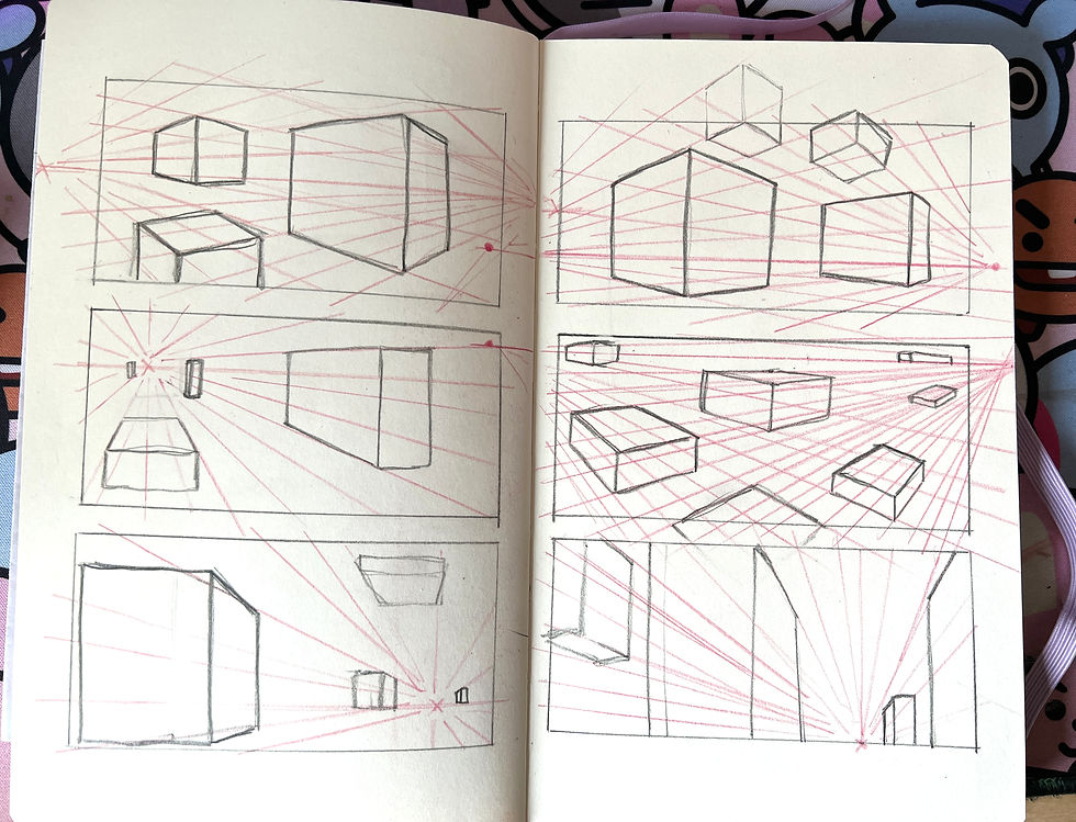
Quick Perspective Exercise
I really need to improve perspective so I found a really good video by David Finch where he goes over horizon lines and 2-point perspective. 11
Planning what I'm doing
I feel like I've done a lot of fantasy stuff and so I think I will do something more familiar, so I think I might do the British Countryside. I'll do some sketches and colour thumbnails, I'll test what I want to use, whether it's ink and watercolour or acrylic paint-- or something new entirely.


As I searched for more ideas, I searched from photos I’ve taken and I really liked the night time photo I had taken years ago. As well as some wild flowers, I think because of Anna Boberg I really wanted to try something new and exciting. I have never done a night-time image before and I really like the midnight blue of the sky in this.


Therefore I tried to incorporate thumbnails I took inspiration from online into more original thumbnails.


I think I’ll explore the third thumbnail of these images, however it’s missing something with perspective technicality, so I may add a house/cabin in the image. Realising how important the lighting and colour of this scene would be, I wanted to do a little research into the hows of Nocturnal scenes.
Colour Research
I want to create a nocturnal scene that isn't just using all black for mid-night landscape, so I wanted to see how I could approach this technicality.
For colours, it's important to understand that yellows, red and oranges are not included in night time scenes. The sunlight makes colours bounce making the fill light warm-toned, so ideally, sticking to blues, and blue greens are ideal. In any normal painting, blues and sometimes purples are used tonally to create the shadows, and the bounce light being the environment colours; in nocturnal scenes the "range" of tones is much less than a daylight scene, adding small amounts of white to create the lighter elements of the scene will demonstrate where the moonlight is hitting it. When researching I found that the sky can sometimes darker than landscape below, which is something I should keep in mind when I approach the painting-- however some artists like to keep the sky lighter in value. 12
Experimentation/ Colour Thumbnails

Process
Swipe to see some of the process
I ended up using acrylic paint because I didn't have a big enough water colour brush, I felt like I would get better coverage of colour; small scale I think watercolour would have done just what I wanted.


Final Piece


Final piece (Video)
Evaluation
I am very surprised with how this piece turned out and I had a lot of fun, I really enjoyed painting with so much space. I feel like with all the planning and research I was able to really improve my work and create something that feels cohesive.
With the research, I really wanted to capture the magic that life naturally has and I wanted to do that with the photos that inspired me, however I feel like it's not as magical as Anna Boberg's work-- maybe if I used oil paints. Looking back, E. H. Shepard didn't really have that much influence over my work since I didn't use ink or pen, which is a shame. I did use Jan van Goyen composition, well, attempted.
Researching nocturnal scenes really helped! I was able to think of how different elements would change under the moonlight, which turned out really well! I reduced the saturation of the colours and stuck to blues and greens.
The process of painting was me mainly focusing on slowly saturating in colour the closer the part of the scene is, I wanted to add a little depth in the painting so I added some trees that slowly receded into the background. I made sure to only use blues and greens, using different shades, tones and variations to creates the house and the shed. I knew I wanted to include the wild flowers that inspired me, therefore I painted them to the foreground which I am really happy with.
At first I made it look like the house was dark, with no one awake, then I really liked the contrasts when I was revisiting paintings during a break so I added a little warm lights to contrast the entire cool painting. The idea of the painting was to feel like you're standing on a hill staring down at a British countryside with the house as a focal point.
To improve I would change the colour/tone of the field furthest away, it's a little too bright for the and feels a little disconnected.
Overall, I was really surprised and happy with how the painting turned out, I like the colour and the depth and I never even knew that this was something I could achieve.
Questions/Reflections
What did you find most challenging?
The most challenging part about this assignment was being consistent with colours, I had change a few ideas as I went along but as I went back over doing different things I ended up losing the colours I was using.
Is this an area of illustration that you have experimented with before?
Not a painting as big as this but I've doing similar things, like the glass windows that were at the beginning, and I did a small size painting before hand, so it wasn't as daunting as when I first created at such a size.
Would you attempt this again and, if so, how would you change or develop your approach?
I would most definitely like to attempt this again but much bigger! I'm not too sure what I would do whether one big drawing or a painting similar like this.
Improving Final Piece
I wanted to improve the piece with the critics I had from family, my Dad said that the little cabin's light wasn't reflecting onto it's surroundings and on the floor so I added that. After a nights sleep I realised that I couldn't be happy until the furthest field feels cohesive with the whole piece, I used more saturated colours but it did end up clashing with the closest field so I used a lighter colour to create some grass impressions; dabbing the paint brush slightly for the furthest field and dry brush swiping for the closer field.


Final Words
I am happy with the end result after reworking it slightly, I knew imagined I could create something like this, the only shame is, is that I wasn't able to find an A0 board, I resulted to using two A1 boards.
1 U/A, DailyArt Magazine 'Anna Boberg- Self-taught painter of Lofoten Landscapes, Sept 2, 2024. https://www.dailyartmagazine.com/anna-boberg-lofoten-landscapes/ Accessed Feb 12, 2025.
2 J Wuyts, Europeana 'Anna Boberg: the Swedish artist who painted the beauty of the northern lights', Mar 18, 2024. https://www.europeana.eu/en/stories/anna-boberg-the-swedish-artist-who-painted-the-beauty-of-the-northern-lights Accessed Feb 12, 2025.
3 M Prodger, The New Statesman 'Anna Boberg's timeless Arctic landscapes', July 13, 2022. https://www.newstatesman.com/culture/art-design/2022/07/anna-boberg-landscape-paintings-lofoten-arctic Accessed Feb 12, 2025
4 Foyer Staff, Foyer 'Anna Boberg braves the Arctic', Mar 8, 2023. https://readfoyer.com/article/anna-boberg-braves-arctic Accessed Feb 12, 2025.
5 U/A, National Galleries 'Jan van Goyen', U/A. https://www.nationalgalleries.org/art-and-artists/artists/jan-van-goyen#:~:text=Gradually%2C%20Van%20Goyen%20began%20using,to%20paint%20pictures%20very%20quickly. Accessed Feb 12, 2025.
6 Britannica, The Editors of Encyclopaedia. "Jan van Goyen". Encyclopedia Britannica, 9 Jan. 2025, https://www.britannica.com/biography/Jan-van-Goyen. Accessed Feb 12, 2025.
7 U/A, Lambiek Comic ' E. H. Shepard', U/A. https://www.lambiek.net/artists/s/shepard_e-h.htm Accessed Feb 15, 2025.
8 S Cascone, ArtNet 'A ‘Winnie-the-Pooh’ Drawing Sets a New Auction Record for a Book Illustration', July 10, 2018. https://news.artnet.com/market/winnie-pooh-drawing-auction-record-1315886 Accessed Feb 15, 2025.
9 Paint Coach, YouTube 'The One Landscape Painting Tip You Really Need', Sept 4, 2023. https://www.youtube.com/watch?v=nGc8RhP-OZc Accessed Feb 17, 2025.
10 Trent Kaniuga, YouTube 'Environment concept art - What I think about when designing a location', Oct 13, 2021. https://www.youtube.com/watch?v=7EHH4MtZ5Vs&list=PLtilnygvZY4GOx_JfgiQr5umsWSNuPbuu&index=25 Accessed Feb 17, 2025.
11 David Finch, YouTube 'Introduction To Perspective', Apr 5, 2022. https://www.youtube.com/watch?v=5lPfz3BFxCM&t=1s Accessed Feb 17, 2025.
12 M Albala, Mitchell Albala ' The Colors of Night: Color Strategies for Painting Landscape Nocturnes', Feb 8, 2021. https://mitchalbala.com/colors-of-night-color-strategies-for-painting-landscape-nocturnes/ Accessed Feb 19, 2025.


Comments