Assignment 10: Rethinking and Realising
- Abbie Vidler

- Sep 4, 2024
- 15 min read
Brief
Produce a body of work that develops, explores and resolves your theme proposal through different stages of development, materials and processes. This is also an opportunity to consider experimenting with new approaches that might augment the audience’s experience or understanding of your artwork?
Several key points to help guide your assignment are:
Your body of work will need to be a minimum of three finished pieces.
If you are working in animation, then a piece of work could be 30 seconds long.
It’s important that you decide on the element of unconventionality, or creative risk that you are comfortable with, rather than trying to second-guess what your tutor may expect. Creative risk is about not knowing an end result, or giving up an element of control, or trying something new. It is not about putting yourself in danger to achieve something. Work safe.
It may be the case that what you propose doing goes ‘wrong’. We would encourage you not to decide too quickly whether you like something or not.
Document what you do as you go along, and if something doesn’t work out or goes ‘wrong’, you can use the images to produce a designed mini publication of your process. This way, the process can be a valid end result too.
Still unsure what to do? How about incorporating an element of chance, participatory drawing, producing a set of instructions for family or friends to complete, art-directing a friend or family member, using a material not associated with illustration or image-making, or finding a new way to collaborate with someone.
When planning how to develop your theme, remember that this project should take about 40 hours of making time, or around 4 working days with another day dedicated to initial research and subsequent written reflection in your learning log or blog.
When submitting your work for this final project remember that you need to submit all your working stages from mind maps, thumbnails, sketchbook material and visual research to final artwork.
Proposal
For this assignment, I will be producing a visual development project for an animation film; with aim to create 5 character designs, 2 environments and produce 3 visual scenes.
I would like to get better with backgrounds and scenes therefore I think this is the best way of pushing myself, and will be a great way of diversifying my skill set.
Mind-map


Research
For this assignment, I am going to be acting as if I was a visual developer for an animation studio, creating environments, character designs and finishing on creating visuals scenes that help convey the mood and potential story-telling of the animation. 1
But what is a visual development artist?
A visual artist is someone who creates the initial ideas of the project, they are responsible for convey the story through visual prompts from the directors and creators. Working in visual development, you may be responsible for one (or more) of the following:
Environments
Characters
Props
Splash Art
Key-frames
Colour-Scripting
Similar to that of a concept artist, working in Visual Development is the umbrella term for all these aspects of the project.
My weakest skill is environments, I've rarely created anything environment wise so I wanted to do plenty of research to prepare me for the visual "splash art".
The first key fundamentals of creating Environment Art, is 'priority', understanding what needs to be in the scene (i.e story elements) will help other creative parties to see what direction you want to go and showcasing what could become of the story.
Another fundamental is, finding the theme and tone of the environment, if it's scary cabin then we need to feel it, we need to see elements that enhance the scary mood of the environment-- aiding the story in a possible direction.
Usability and interactivity is another fundamental, more in video games, however it's good to think about how characters will interact with the environment around them.
From the fundamentals comes what the "visual hierarchy" is in an environment. Sustaining good environment art is to be able to realise what should be used and how much focus should be on it.
Shapes: Using shapes to create focus help block for composition, and is one of the important elements to creating pretty much everything; shape language can define an object and build structure in scenes.
Light: Light can help define the mood and tone of a scene, but it can also create focus, by highlighting you are drawing the eyes from whats important to the image.
Detail: Reducing detail from one area to your area you want to focus on (not only saves time) but will capturing the important area of the environment.
Story-telling: Adding elements like the climate of the scene, the place of origins' culture makes the environment feel interactive, and doesn't create such a empty and dully environment for the characters to be in.
Research: One of the most important thing any artist should do, is research, to make the environment fully fleshed out and grounded it needs to be believable; say you story takes place in jungle in Brazil finding a hidden society, you're going to have to research what type of trees, species are there-- you'll need to uncover what the culture is like, what they wear, what sort of building do they have and so on.
Artist Research
Allison Perry
A visual artist working in-studio as a environment designer creates fun, textured-heavy visual scenes. Allison Perry emphasizes that research is an integral part to her creative process, for her it allows her to design much more quickly and effectively. When it comes to the creating the designs, she will choose a medium that feels natural to her at the time, whether it is pen, pencil or her Cintiq. 4
Observing her work and her portfolio, she creates great story-telling visuals that are pleasing to the eyes; her character designs are highly expressive and gestural. Beautiful colours go through her works and visual effects add to the ambiance of the scenes, she is able to create great dimension in her work and effective depth.
I really love the openness of both her work and her approach, she doesn't tie herself down with the same medium every time and she ensures she does plenty of research before going into the final pieces. The results are beautiful and the use of light in her works intricate and delicate.

David Hall
An Illustrator born in Ireland in 1905 and moved to the USA where his artistic skills where introduced into "Hollywood", one of the first illustrations were for King Kong with those concepts caught the eye of Walt Disney. His skills produced concepts for Snow White, Pinocchio and Bambi, what captured my eye at the Disney 100 Exhibition was his concept illustrations of Alice in Wonderland. Walt Disney thought that these illustrations were too dark for an animated movie and was on hold, Disney later made Alice in Wonderland but not in David Hall's style.
I love the fluid pencil/pen marks and the use of expression on the characters, there's lots of detailing in the line work and has a lot of character in the work; because I want to do my work traditional, I will keep and extra close eye on David Hall's work, his work is watercolour, pencil and ink which is the traditional mediums I tend to use.


Simon Stålenhag
Stalenhag creates hyper-realistic art that "blends mundane scenes from the Swedish countryside", creating eerie scenes that include "abandoned robots, mysterious machinery and even dinosaurs'. His inspiration was that of Gunnar Brusewitz, Lars Jonsson and Syd Mead who was a production designer of Blade Runner, Aliens and Tron. 7
Stalenhag has great use of light in his work, a wash of colour "blends throughout the surroundings" making it hauntingly beautiful, it all feels so coherent. Looking at his work is like "you're seeing the beauty in nature" and the seeing how the technology disrupts the environment.
I love how Simon's work blends to naturally with each other and the colour and light is just so beautiful. I've chosen Stalenhag as one of my artists because of the how incredible every element of Simon's work, the composition, the lighting, colour and the story elements; and considering the sci-fi elements that I would like for my work this artist is perfect as inspiration.

Project intention/story
For this story, I am planning on creating a band set in a sci-fi world where technology and nature collaborate together peacefully (similar to Simon Stalenhag but warmer and more connected). The story tells of a band as they try to get there name out into the world, but after the loss of their most dedicated member times are tough. Overcoming personal battles as they create music, will they make it?
Visual Research
Mood Board
I really want to capture British architecture/culture and sci-fi, I'll mood board each character I want to create to try and flesh out what they will look like before I jump straight to sketching.

Character Designs
Mood board for each character


Sketches/Initial Ideas
Issac


Naomi


Ivy


Koji & Riku (Twins)
Riku

Koji

Their Face (Identical)

Character Sheets
Issac

Naomi

Ivy

Riku

Koji (Riku's Twin)

Props

Rough colour
Planning the colour before jumping in, I want each character to feel individual from another but tying in their logo or similarities with another; each having their own colour, with the last character Koji being a stand-out colour as he's the character we will lose.

Line-up
I will explain each character from left to right:
Issac the bassist, wide shoulders and red to symbioses his important status of the group; the father of the group and the eldest, his style is the most developed since he's been around music more. Cowboy, fun aesthetic as he reminisces with his Dad on old cowboy movies, almost like bringing his Dad with him on stage-- also where he gets his "Dad" behavior. He has a noticeable tech around and in his eye, as an tech advancement equivalent to AR/VR today...
Naomi the singer/dancer, the bubbliest of the group and the most active, her style is cutesy and round to reflect her personality. Long hair to enhance her dancing experience and tech shoes to give her extra bounce and support; her bubbly personality makes her more vulnerable and naive but she is second oldest of the group. Big sleeves to make her dancing look much more fun, a simple look to avoid a distracting stage performance.
Ivy the drummer, the youngest and loudest of the group which makes her annoying at times, but all that noise is to hide her lack of smarts and confidence. She has a tech/robot arm due to losing her arm as a child but comes very handy for her extreme drumming-- a simple nature tattoo on the other arm to show her love of nature and tech (reflecting the culture). Short sleeves to show her arms and making it easy to play, and an unusual haircut to express her developing style.
Riku the guitarist, a twin with Koji, Riku is very emotional (and with losing his brother makes him quick-tempered), with being emotional makes him protective which can make him overbearing at times (but mainly due to the grief). His short sleeves make it easier for him to play and loves his spiky in-ear pieces that reflect his quick-tempered ways.
Koji, singer and dancer, is shy and overly-trusting at times which ends up getting in a bit of trouble. He acts very much like a big teddy bear, big and cuddly, and wears big clothes to reflect that and his wanting to hide himself (despite becoming himself on stage). His in-ear's include a circle hologram, with earthly colours of his colours he much prefers the nature side of their culture.

Reflecting
I really like how these sketches have turned out, they show a lot of character and fun, and additionally, I really liked how the line-up turned out; I wanted to create something that could be seen in a portfolio.
Environment
Thumb-nailing/Sketching

Experiment
I haven't used watercolour for landscapes in a very long while so I wanted to give it a go along side some thumbnails I liked the most, and adapting the bottom experimental piece for fun . The outcome was pretty bad, so I wanted to regroup myself, pick some colour schemes and look back at my research before jumping into the final work.

Environment Art
Colour Schemes:


The Illustrations/Concept Environment Art
Interior
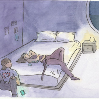
I wanted to show the inside of Riku's bedroom, hints of tech can be seen and his room is a bit messy...

Exterior
I wanted to capture British architecture (from mood board) and nature together, all while making sure that it's futurist enough. Today when you look at tall high-rise buildings you see a variety of different lighting styles, blue screens for tech and pink/red for LED's, some warm lighting of the "big" light. I want to imagine that in the future, so I included that in the window, I tried my best to capture the detail of classic British buildings-- and wanting to include nature to balance it out and reflect the culture of the story.

Reflecting
I am really impressed with how these environment art turned out, I've not been especially good at creating environments and perspective, but with experimenting before hand I was able to capture more of what I wanted to achieve the second time around. I wanted to make sure I had a colour scheme involved so I prepared before hand, and I wanted to create technology alongside nature unlike other sci-fi settings.
Visual Scenes/Art Splash
Thumb-nailing
My parents and I picked the ones we liked, and from there I slightly adapted the favourites to add more style and emotion.

Colour/Light Planning
Before going in, I need to decide what the colour and lighting should be so I have fun understanding what I need to do when I get into it...

Mini Research
Since it's been a while since I've touched watercolours, I wanted to look at how to create effective light and colour to watercolours; I looked up a great lighting watercolour tutorial that also helped relearn some of the key factors of using watercolour.
Something I have never really done with any watercolour pieces is coat the paper with water first, from there it makes it much easier to create beautiful water textures and to create flow of paint on the page. From there, I should the light into the pieces first, and since light spreads the brush should hold the water-- making the light spread across the paper.
After that, shadows and darks should go in, using dark values and use a damp brush with no colour on the blend the colours together. After that it's adding our colours and details, eventually going back in with darker colours to boost the shadows. 9
Process
I started off with a sketch on watercolour paper then used ink on top; from there, I drenched the paper before adding light and shadows, then added details. To add more contrast, I took the original paintings (below) and adjusted the brightness and saturation to improve the shadows and make the lights pop!


Visual Scenes & Reflections
A scene between Riku and Ivy, late night talks after band practice. (Watercolour)

I'm incredible happy with how this turned out, I wanted to include the environment and the character among each other and it turned out well; the environment could have a little more detail and the perspective could be better. But as one of my first of challenges I was very impressed. I wanted to use very low-lighting in this scene and achieved this with the use of dramatic dark tones and hints of lighter tones.

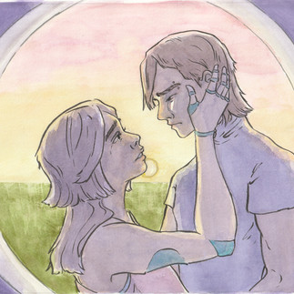
An intimate moment between Riku and Ivy as Riku attempts to come to terms with the loss of his brother. (Watercolour)

When I finished this piece I really couldn't be any more happier, with a little exposure and colour adjustment on the computer I was able to enhance the shadows much more to create a more effective dramatic scene. Originally the storyboard/thumbnail was them two standing apart from another and looking lovingly in the eyes, however, as I imagined what the scene could be I wanted a physical touch between them to show endearment. One of my favourites...

Koji and Naomi on stage, both singing and dancing-- but will it be there last stage? (Watercolour)

I was a little unsure on this illustration at first, so I took the image to procreate and played with the lighting a little when I realised, "they're on stage, there would be a spotlight".
Darkening the edges pulled off the illustration perfectly, I was really glad I was able to take my time with the illustration to see what would improve it and then pulled it off.

Issac shows concern for Naomi as the attempt to perform without Koji. (Digital)
I did a digital version and immediately regretted it, I tried so hard to create a dramatic scene between Issac and Naomi but the digital feels so flat and has no emotion to it. The storyboard looked so much better on paper but when it came to it, it turned out dreadful.

Evaluation
For this assignment, I wanted to challenge myself by creating visual development of a project. I wanted to create 5 character designs, 2 environment concepts, and 3 visual scenes (+1 since I ended up doodling one night). The concept was for an animation and tells the story of a group of friends who have created a band together, troubles arise and one of the members ends up passing away, the band will attempt to make a name for themselves in memory of their fallen member.
I had a lot of fun for this assignment, but I also wanted it to be challenging; coming from my last assignment, I knew I wanted to create using traditional media and I also wanted to improve my backgrounds.
What I found is that I am slowly enjoying watercolours, I like the flow of watercolour and regardless if it created pools of colour when it should've been smooth blend- I found it having more character.
Starting off with the character designs, I simply couldn't be happy with how they turned out, for criticism I would say I should look back at my statement of wanting to include British culture into it and maybe added some different types of fabric, however since it's set in a fictional world I am not too fussed with that. I liked how the character sheets turned out, and really pushed myself to do a line-up (despite it being in digital).
For environment art, I would say that I've slightly improved, the art isn't particular interesting nor does it have fun perspective, but it does let us know what the fictional world is like, with both nature and almost a steam-punk aesthetic. I feel like I am improving with perspective; and it really helped to do thumbnails before hand to explore different locations and ideas.
The visual scenes, another, I couldn't be happier. I am so proud of myself with how they turned out, they tell a story and they show emotion AND IT'S DONE TRADITIONALLY! With the help of digital of course... The perspective is something I need to improve on, I feel like I should go out and observe building more to really grasp sizing and point perspective.
Planning helped me a lot and helped build the foundation for what I needed to create, so I didn't go in panicking and messing up. I used thumbnails, colour thumbnails, sketches and referred to references for poses, facial expressions and building foundations.
Researching being a visual developer, and exploring each aspect of the job helped me a lot. I learnt different ways to create focus, how to create emotion in a scene. With artist research it opened up a confidence in working in another medium, exploring the sci-fi genre and seeing how visual development artists show their work.
One criticism I will say, the digital just does not do it for me, the idea seemed to interest me and I really wanted to show off my favourite character Issac; however, there isn't any charm in it, and the emotion feels very flat. Looking back now, and typing this, I'm going to do a visual scene for Issac-- a better one.
Another one!
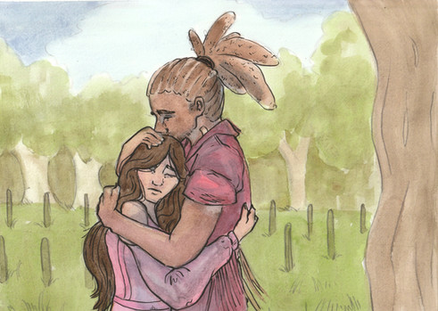
Issac comforts Naomi (Watercolour)

I wanted to do Issac in a scene, so I sketched up some thumbnails then sketched on watercolour paper-- from there I painted using watercolour. This time I made sure my sketch was loose and prominent and it was still visible underneath the watercolour, but I went back over in ink.
Yes. Just Yes. This is it. I feel like I've done well enough to know that I could have a chance of making it as an artist. I'm so glad that I decided to push forward and work on my criticism and produce another piece to add to my final work. I wanted to make a scene that showed Issac protective and compassionate side, so here he comforts a sad Naomi.
My Assignment Final Work Altogether
All of my final pieces all together...


Final words
Looking back at all the visual development I have created, I feel as though my visual scenes were the best at of all of them; next to that would be there character designs-- all I need to improve on in this case would be the environment art.
Due to planning and researching, I feel as though my outcome exceed my expectation when it came to be executing my art; I'm able to see how my art has improved with learning/improving my watercolour skills, and learning/focusing on keeping my hand loose when drawing.
Looking at what I had to improve on from my last assignment, by focusing on traditional mediums I was able to think creatively about the different techniques I could apply to my illustrations. Even though the digital medium is quicker and producing results (with my last assignment being a digital comic with scanned ink drawings), I would say my artistic skills lean more into the traditional sense- it looks more natural and interesting.
1 MasterClass, MasterClass 'How to Become a Visual Developmental Artist', Jun 10, 2021. https://www.masterclass.com/articles/visual-development-artist-guide. Aug 18, 2024.
2 ValhallaForArtists, Youtube '"WHAT IS VISUAL DEVELOPMENT?"- Lecture 01- Valhalla For Artists Camp', Jun 27, 2022. https://www.youtube.com/watch?v=185hnTQKxkI&t=2614s Aug 18, 2024.
3 Riot Games, Youtube 'So You Wanna Make Games?? | Episode 4: Environment Art', Dec 13, 2018. https://www.youtube.com/watch?v=37LVhP15zGw Aug 20, 2024.
4 Michal Dziekam, Character Design References: Interviews 'Alison Perry', April 5, 2017. https://characterdesignreferences.com/blog-interviews-5/allison-perry Accessed Aug 20, 2024.
5 Allison Perry, Allison Perry, U/A. https://www.allisonperryart.com/Accessed Aug 20, 2024.
6 Peter Richardson, Cloud 109 'David Hall- Disney's Dark Concept Artist', Mar 16, 2010. https://cloud-109.blogspot.com/2010/03/david-hall-disneys-dark-concept-artist.html Accessed Aug 20, 2024.
7 Jacopo Prisco, CNN Style 'Simon Stålenhag’s hauntingly beautiful retro sci-fi art', July 30, 2018. https://www.cnn.com/style/article/simon-stalenhag-sci-fi-art/index.html Accessed Aug 20, 2024.
8 Joshua Krook, New Intrigue 'The Art of Simon Stålenhag', Mar 12, 2021. https://newintrigue.com/2021/03/12/the-art-of-simon-stalenhag/ Accessed Aug 20, 2024.
9 Matthew White, Youtube 'How to Paint Light in Watercolor', Aug 9 2023. https://www.youtube.com/watch?v=vlB6RmAursc Accessed Sept 4, 2024.


Comments